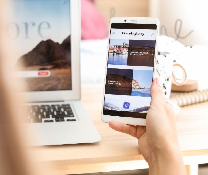
Making an email mobile-friendly allows 43% of recipients who access their emails on mobile devices to engage with their healthcare providers easily. An email is mobile-friendly when it uses several techniques like responsive design and concise, easily readable content.
Getting the layout right
Using responsive design
Responsive design creates an email that adapts to different screen sizes and devices. This approach involves using flexible layouts and scalable images. A 2022 Springer Nature study offered an introduction to the purpose of responsive design in web design, “The purpose of responsive design is to provide access to the content of websites from all devices. The users should be able to access the content of websites regardless of the device used.” To achieve responsive design, start by using responsive email templates. These templates are specifically designed to adjust to various screen sizes automatically.
Next, incorporate CSS media queries in your email’s code. Media queries allow the application of different styles based on the device’s characteristics, such as its width. Finally, use fluid grids, which rely on percentages instead of fixed widths for layout elements. This way, your email content will stretch or shrink to fit the screen.
Single-column layouts vs. Multi-column layouts
When designing emails for mobile devices, single column layouts are generally more effective than multi-column layouts. Single-column layouts present all the content in a vertical format, making it easier for users to scroll through and read the email on a small screen. This layout prevents the need for horizontal scrolling, which can be cumbersome on mobile devices. On the other hand, multi-column layouts can become cluttered and difficult to navigate on mobile screens.
Optimal email width for mobile devices
The width of your email significantly affects how well it displays on mobile devices. To make your emails easily readable and navigate on small screens, keep the overall email layout to a maximum width of 600 pixels. This width works well across both desktop and mobile platforms.
Within this layout, design content sections to be around 320-480 pixels wide. This width range fits comfortably on most mobile screens without requiring users to zoom in or scroll horizontally. Using fluid design principles, where you define widths in percentages rather than fixed pixel values.
Ensuring images are scalable and optimized
Use responsive images with CSS rules such as max-width: 100%. This rule ensures that images scale down to fit the screen size without becoming distorted. Additionally, optimize your images by compressing their file sizes. Smaller file sizes reduce loading times, which is especially important on mobile networks that might have slower speeds.
Always include alternative text (alt text) for images. Alt text provides a description of the image, ensuring that if an image fails to load, the user still understands its context. Finally, avoid using overly large images that can slow down email loading times. Resize images to the dimensions they will appear in the email to balance visual quality and performance.
Creating optimal content
Writing concise and engaging subject lines
The subject line is the first thing recipients see, and it greatly influences whether they open the email. To make subject lines engaging:
- Aim for 40-50 characters so it’s fully visible on most devices.
- Encourage action or convey urgency. For example, “Book Your Free Health Check-Up Today” is more compelling than “Health Check-Up.”
- Including the recipient’s name or specific details relevant to them can increase engagement. For example, “John, Your Health Tips for June.”
- Ensure the subject line accurately reflects the email content. Misleading subject lines can lead to frustration and unsubscribes.
- Pique interest with intriguing phrases. For example, “Discover How to Boost Your Immune System.”
Keeping preheader text relevant and short
The preheader text is the snippet that follows the subject line in the inbox preview. It should complement the subject line and encourage the recipient to open the email:
- Provide a brief summary that complements the subject line. For example, “Learn simple tips to stay healthy this summer.”
- Aim for 50-100 characters to ensure it’s fully visible in the inbox preview.
- Align with the subject line: Make sure the preheader text expands on or supports the subject line. For example, if the subject line is “Free Health Check-Up,” the preheader text could be “Schedule your appointment now.”
- Don’t repeat the subject line. Instead, add additional value or context.
Prioritizing essential information at the top
Most recipients skim emails, especially on mobile devices. To capture their attention quickly:
- Place key details, offers, or calls to action at the top. For example, if the email is about a health event, mention the event date and registration link first.
- Start with a strong statement or question that grabs attention. For example, “Did you know that regular check-ups can prevent major health issues?”
- Start with broad, important information and narrow down to the details. This keeps readers engaged as they scroll.
Using bullet points and short paragraphs for readability
To make the email easy to read and digest:
- Break down information into bullet points for better readability. For example, list the benefits of a new health program as bullet points.
- Limit paragraphs to 2-3 sentences. This prevents the content from looking overwhelming and keeps readers engaged.
- Use bold text for important points or headings to guide the reader’s eye through the email.
See also: HIPAA Compliant Email: The Definitive Guide
Using an effective call to action
A call to action (CTA) directs the recipient towards a specific action you want them to take, such as scheduling an appointment, downloading a resource, or making a purchase. An effective CTA benefits your email campaign by increasing engagement and conversion rates.
How to create a call to action:
- Make sure that it is concise, action-oriented, and visually prominent.
- Use compelling language that encourages immediate action, like "Sign Up Now" or "Get Your Free Guide."
- Place the CTA in a noticeable location within the email and make it stand out with a button or bold text.
See also: How to create an effective email marketing strategy?
FAQs
What is the role of font size and type in mobile-friendly emails?
Choosing a readable font size and type ensures that the text is easily legible on small screens.
How can I ensure my emails are not marked as spam?
To avoid being marked as spam, use a reputable email service provider, avoid spammy language, and ensure your email list consists of recipients who have opted in.
How should I format my email footer for mobile devices?
Format your email footer with concise text, clear contact information, and easily tappable links to comply with legal requirements and enhance usability on small screens.
Subscribe to Paubox Weekly
Every Friday we'll bring you the most important news from Paubox. Our aim is to make you smarter, faster.


