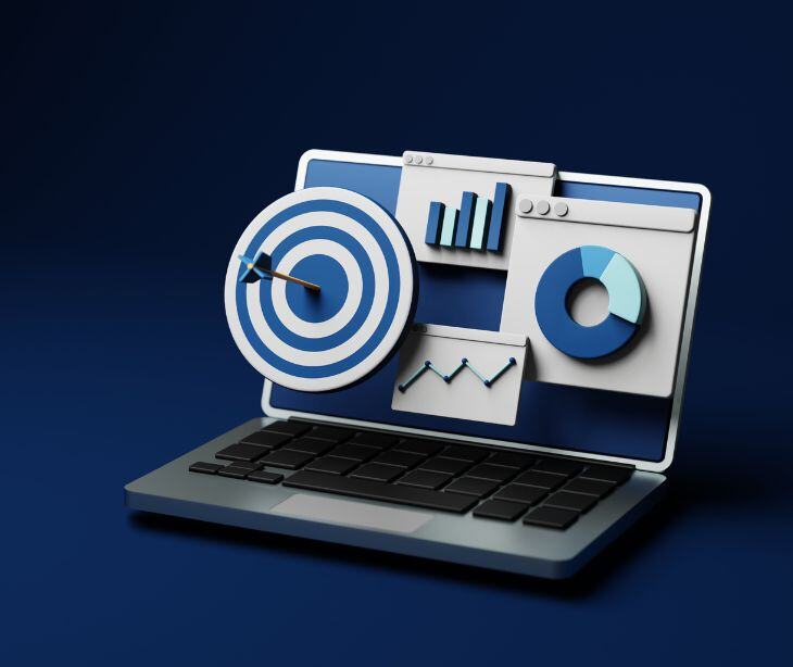
Data visualization represents data in graphical formats, like charts and graphs to provide understanding and insight into complex datasets. According to a journal article published in Big Data, “The field of data visualization has experienced tremendous growth as multiple industries have attempted to harness the power of big data. The goal is to produce easily understood visuals to aid the users’ ability to quickly and accurately process information so that conclusions can be drawn, decisions made, and actions taken.”
The use of data visualization techniques by healthcare professionals can quickly identify trends, patterns and anomalies that may indicate potential health issues or operational inefficiencies. For example, during situations like the COVID-19 pandemic, visual dashboards were used to track outbreaks to provide for areas with increased infection rates.
Common types of data visualization
- Column chart: A straightforward method for comparing different data sets, often used to track changes over time.
- Line graph: Ideal for displaying trends and changes over continuous data, showing how values evolve over a specific period.
- Pie chart: Represents parts of a whole, with each slice indicating the proportion of each category relative to the total.
- Bar chart: Used to compare different categories or values along two axes, providing a visual representation of categorical data.
- Heat map: Utilizes colors to represent values in a matrix format, making it easy to identify trends and patterns in large datasets.
- Scatter plot: Displays the relationship between two variables by plotting data points on a Cartesian plane, helping to identify correlations.
- Bubble chart: An extension of scatter plots where the size of the bubbles represents an additional dimension of data, providing more context.
- Funnel chart: Illustrates a sequential process, showing how data decreases through various stages, often used in sales and marketing contexts.
- Radar chart: Compares multiple variables for different categories, useful for visualizing performance across various attributes.
- Tree chart: Displays hierarchical data in a tree-like structure, representing relationships and proportions within categories.
- Gantt chart: Commonly used in project management to illustrate timelines and tasks, showing the duration of activities over time.
- Venn diagram: Compares two or more items by highlighting their similarities and differences through overlapping circles.
- Donut chart: A variation of pie charts with a hole in the center, allowing for additional information to be displayed in the middle.
- Waterfall chart: Visualizes incremental changes between two points, showing how different components contribute to a total value.
Data visualization in healthcare communication
Data visualization improves healthcare communications by taking complex medical data and transforming it into intuitive visual formats. Providers can convey information more clearly and effectively to both colleagues and patients. The clarity benefits a field where timely and accurate communication can directly impact patient outcomes.
For example, when patient health metrics are visualized, clinicians can quickly identify trends or anomalies that may require immediate attention. The convenience serves to be valuable in emergency situations or during patient consultations where clear, concise communication is necessary. When data visualization is used alongside HIPAA compliant email platforms like Paubox can be easily conveyed to patients in a way that remains secure.
FAQs
Who can access shared health data?
Access to shared health data is typically limited to authorized personnel, including healthcare providers, researchers, and public health officials.
How does HIPAA impact data sharing?
HIPAA sets guidelines on how protected health information (PHI) can be shared. Covered entities must obtain patient consent before disclosing identifiable information unless the disclosure is for treatment, payment, or healthcare operations or falls under specific exceptions outlined in the law.
What is a Health Information Exchange (HIE)?
An HIE is an organization that facilitates the electronic sharing of health information among different healthcare entities. HIEs enable providers to access and share patient data securely, improving care coordination and reducing duplication of services.
Can data be shared without patient consent?
Yes, under certain circumstances outlined by HIPAA, such as for public health activities or when required by law.
Subscribe to Paubox Weekly
Every Friday we'll bring you the most important news from Paubox. Our aim is to make you smarter, faster.


